

Client
Self-Directed for School
Role
Branding, Packaging
Project Brief
In our design 3 class at Humber College, our instructor gave us a brief. In the brief we were told that we had the choice to rebrand an existing winery or create our own, and I decided to create my own. In this case study there will be branding, and packaging art pieces.
History/Narrative
Red Maple Vineyards is a Canadian owned winery that first started out in Niagara during the year 2017. RMV focuses on authenticity, as well as making their wine organic to give the customer a true wine tasting experience. The wine is organic which makes it stand out more from our competitors. Our winery is based on a symbol that has been around for 50+ years, the maple leaf, and it is also based on the maple trees. The wine is exclusively produced in north America. The colour red represents the Canadian heritage. The flavor of the wine is a maple flavor. RMV hopes to be able to expand outside of North America to different countries all around the world.
Name Selection
The thought behind the name of the winery was all about representing Canada, red is the colour that is used on the Canadian flag. The word maple has to do with maple trees that are in Canada. It is also about the Canadian symbol on the flag, which happens to be the maple leaf. The words “Red” and “Maple” represents Canada the most in my opinion.
Demographic


The target audience is geared towards men and women aged 35–45, sitting in the above average income bracket, and have a lot of disposable income to spend on wine. These types of people live in the rural areas, and enjoy spending time with their friends and family.
The Logo

For the logo I decided to go for an in-between a modern and classic style. It’s modern because I used a sans-serif typeface for the text “Red Maple”. It’s also classic because I used an elegant serif typeface for the text “Vineyards”. The symbol is a vector illustration of a maple tree, I decided to create a maple tree because it represents what the brand stands for, and goes with the authenticity/organic theme that was a part of the narrative.
Branding Touchpoints
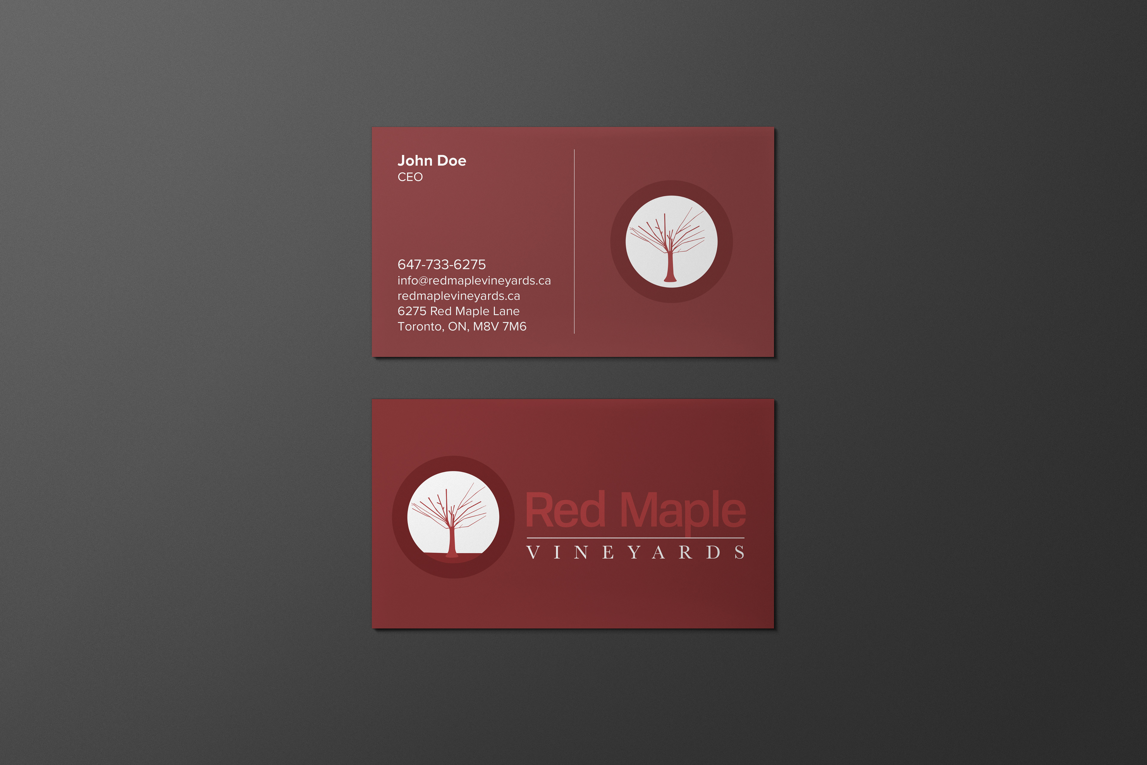
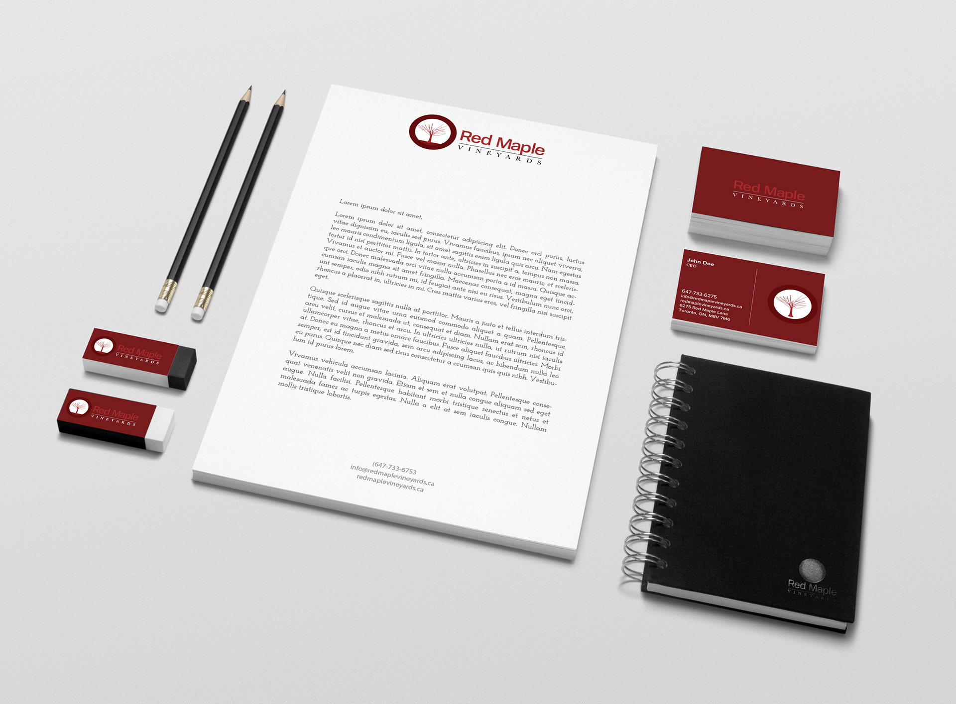
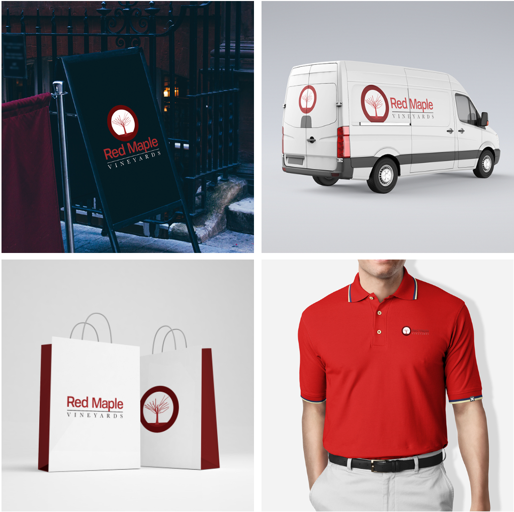
The logo was applied very effectively on each of the touchpoints because the colours and typography were used consistently throughout the whole process. The colour maroon works very well on black and white backgrounds. Maroon works very well for a winery brand, it is a very elegant colour.
Packaging
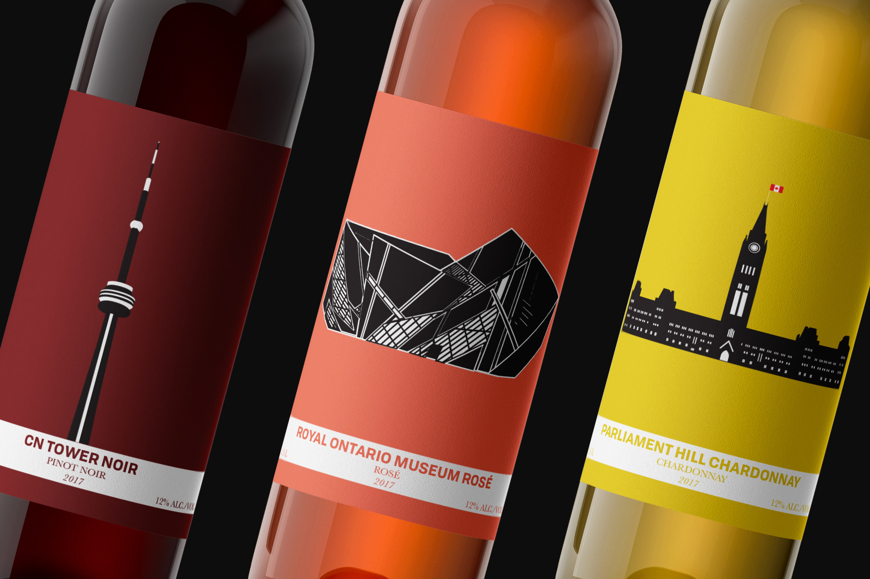
In addition to the logo and branding touchpoints, there was also a packaging portion to the project (of course) because it’s a winery. I created three different wine labels for our wine bottles. The wine bottles are sold in a set, and the set is called The Ontario Landmarks Collection, you’ll see why. I decided to create a wine set that is about the Ontario Landmarks because the winery originated in Ontario. This is a very special wine set because it is the first wine set that RMV came out with.
The first label is the CN TOWER NOIR which is a tourist attraction in Toronto, ON, the flavor is pinot noir because the CN Tower shines bright when it is dark in the city of Toronto.
The second label is ROYAL ONTARIO MUSEUM ROSE which is art museum also located in Toronto. It is well known for its very abstract architecture, the flavor is rose because it is an art museum and art is colourful.
The third label which is also the last label in the set is PARLIAMENT HILL CHARDONNAY which is a major landmark in Ottawa, ON, the flavor for this one is chardonnay because the Parliament Hill is a very historical building and it is usually seen in daylight.
Conclusion
Red Maple Vineyards is a Canadian winery aimed towards people who enjoy drinking wine, and I believe that the brand expresses that image very effectively through the application of the logo being used on a business card, uniform, shopping bags, vehicle graphics, and signage.
The difficulties that I had with the logo was that I had trouble deciding which typefaces to use for the wordmark because I wanted to make the wordmark in-between modern and classic. So, I decided to narrow it down to two typefaces for the wordmark. The difficulty I had with the packaging part of the assignment was figuring out what I wanted the wine set to be called. I also had trouble thinking of a concept for the wine set.
At first, I was thinking of doing tourist attractions all across Canada but that didn’t work because each bottle at to relate to one another in a certain way, and they had to look cohesive. So, then I narrowed it down to provinces and I decided to just do Ontario because it is one of the most popular provinces in all of Canada. I also had difficulty coming up with a winery, I didn’t want to rebrand a winery because I wanted to be innovative a come up with something from scratch.
When I was thinking of what concept to go with for a winery, I decided to choose a theme that focuses on authenticity wine. Then I thought about how there aren’t any wineries that are about Canada as a whole, and that’s when I knew I wanted to do something that had to do with Canada.
When I was mind mapping the words red, and maple, resonated with me a lot and those are the words I think about the most when I think of Canada. I am thinking about creating a website to be an extension of this project because websites are very important because every company needs a website in order to promote their business and so that people can find out about the business.