Client
Self-Directed
Role
Branding, Web Design
Project Brief
For my Corporate Design 2 Class at Humber College, we were assigned a project to create a new narrative as well as an identity for said company. Secondly, we made a slide deck that contained research like the competitors, a 2x2, etc.). Lastly, we were given instruction to redesign the logo for the company, and then we had to apply it on many different touch-points to be used as a system that would be suitable for the company.
History
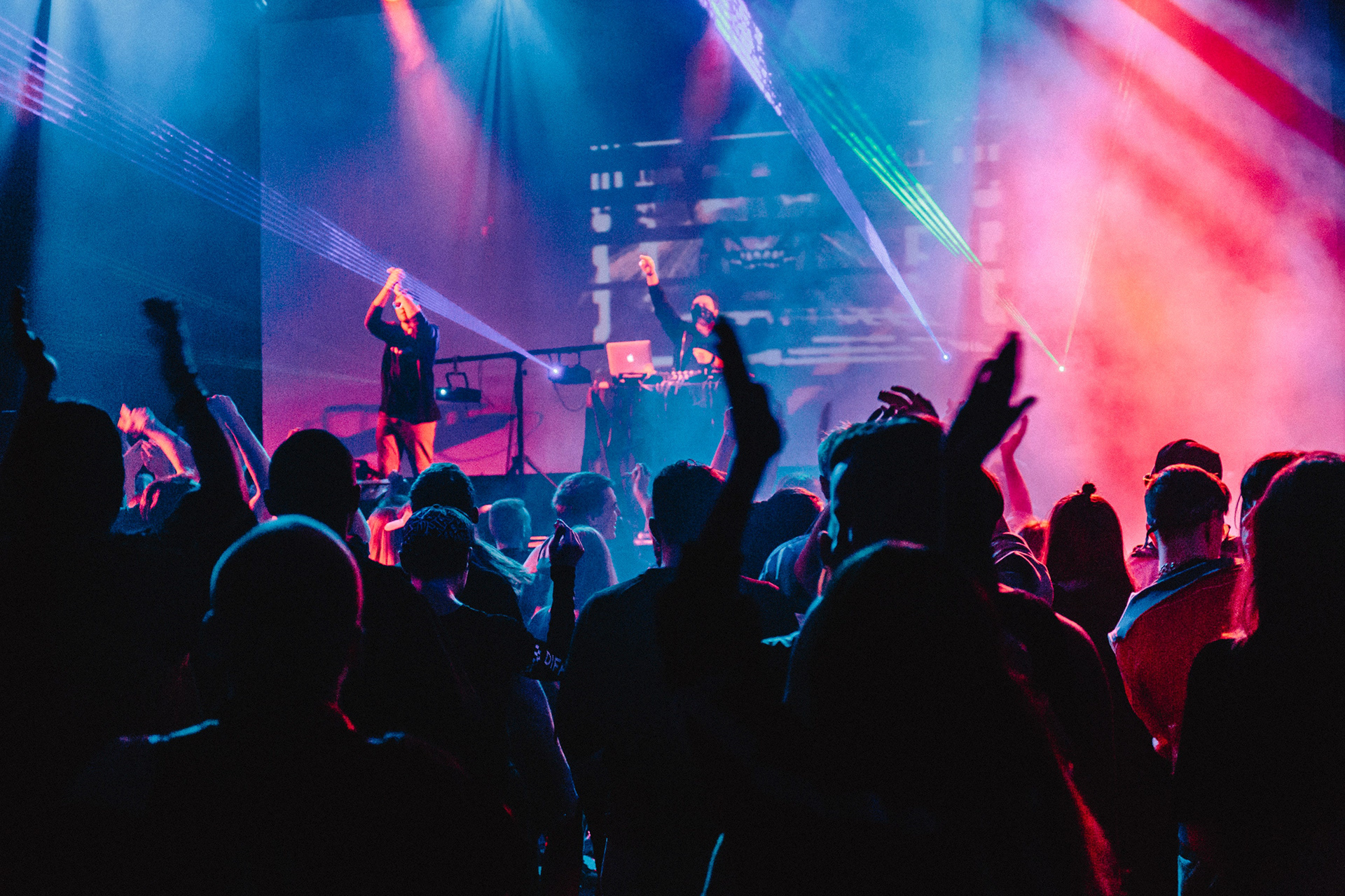
The story behind Festicket is about three friends that were planning a trip to attend a musical festival named Coachella, and they weren’t sure if they wanted to book a hotel, a hostel, or which level of ticket to purchase. The booking method was very difficult for them, after their struggle they came up with the idea of booking transportation, hotel, and concert tickets all in one package to save time, and thus Festicket was born!
Demographic
The target audience is male and female, aged 18–25 mostly young adults. From anywhere around the world. People who have average to above average income, and like to spend a large amount of money on meaningful experiences. The audience is very adventurous, courageous, enthusiastic, outgoing, and has a strong passion for music.
Mission Statement
The client’s top priority is to create a quick and easy ticket booking experience for people who enjoy attending festivals out of town and don’t have a lot of time to book transportation and a hotel to stay at.
Narrative
Modern, Ambitious, Innovative. To make life easier for people who plan on attending large music festivals, and have a lot of disposable income to spend on seeing their favourite performer live.
2x2

This 2x2 is a comparison between the direct competitors of the client. All of the companies are located in the bottom right corner. Songkick is the most modern, and Festicket is the least modern but it is the most obscure.
Audience Review
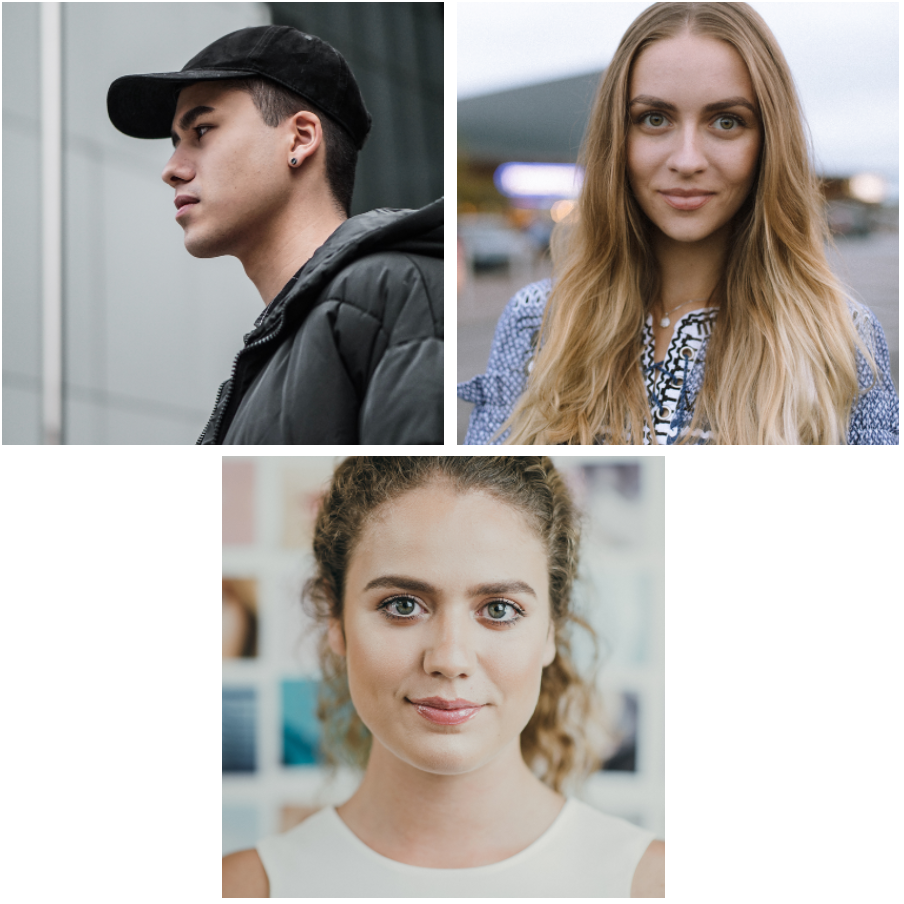
The first person is Brian, he is in the low-income range and makes $20,000–$30,000 per year because he works a part-time job while being a student that is currently attending university. He enjoys taking long walks at the beach, camping, and going snowboarding.
The second person is Veronica, she is in the average-income range and gets $50,000–$60,000 per year because she works full-time in a design studio with 10 years of experience. Her hobbies consist of spending time with friends and family, hiking, and skiing.
The last person is Jessica, she is in the above-average income range and earns $$80,000–$100,000 per year because she is a creative director with 15 years of experience. In her spare time, she enjoys reading books, traveling, and playing the piano.
Challenge #1
Creating a symbol for the logo was very tricky because I wasn’t entirely sure of what to make the symbol. After sketching several different concepts, I finally decided on an idea for the symbol, and when I transferred my idea to digital it didn’t really turn out how I expected it to.
Challenge #2

Selecting a colour for the logo was a really big challenge, because colour is a very psychological thing. You have to choose the correct colours in order to set a specific tone or mood. The colour I selected was purple which was the existing colour for the logo. But I noticed afterwards that, the colour purple doesn’t really represent excitement or joy, which are things that you would experience at a festival.
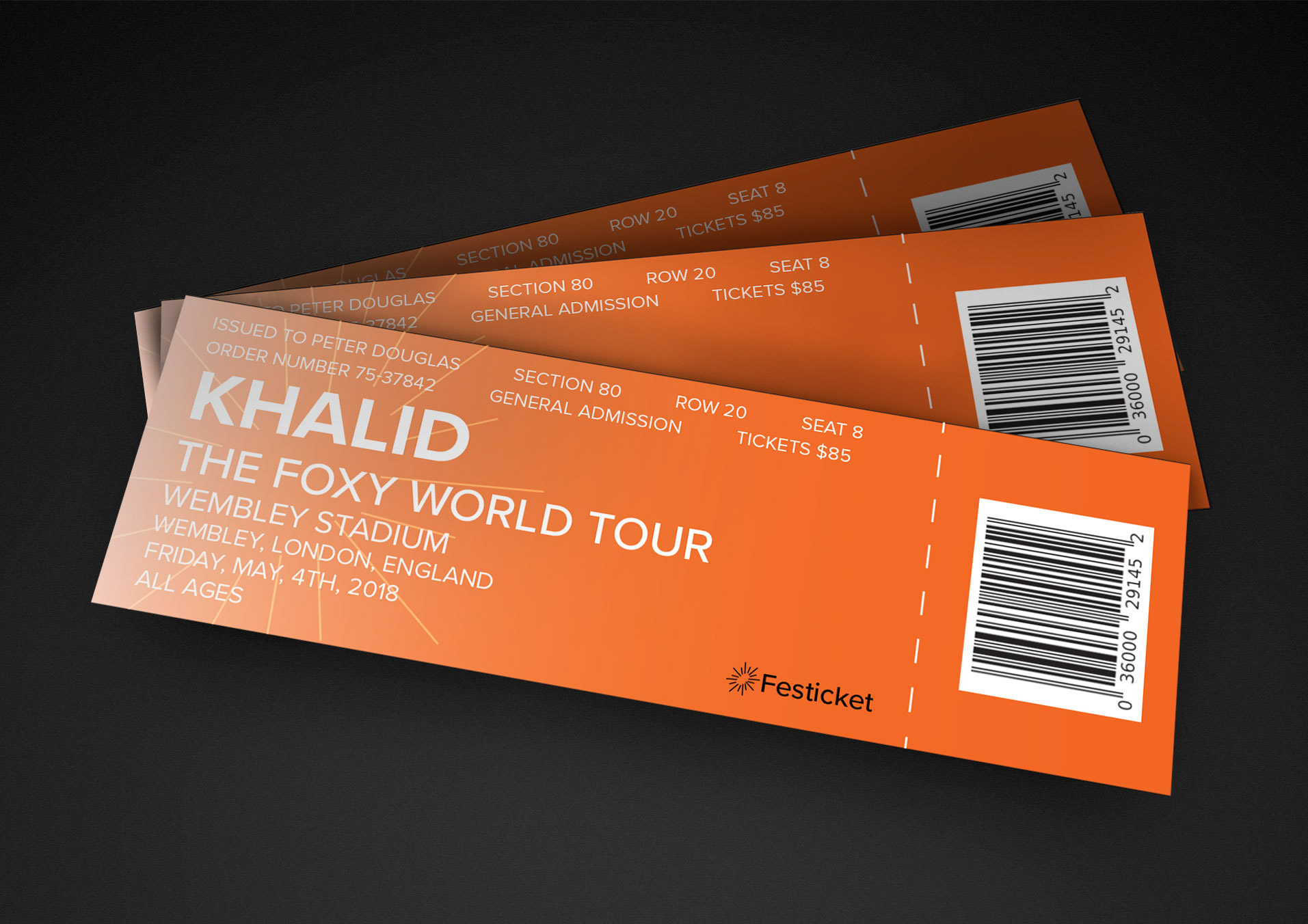
The Logo

I was told by one of my peers that the symbol looks too much like a sun. I tried to experiment with different shapes for the symbol by making it look unproportionate, because that’s how fireworks are, they aren’t perfect circles they are unequal shapes. To fix that I decided to make the logo into more of an oval shape instead of a circle, and that translated more to a firework.
Branding Touchpoints
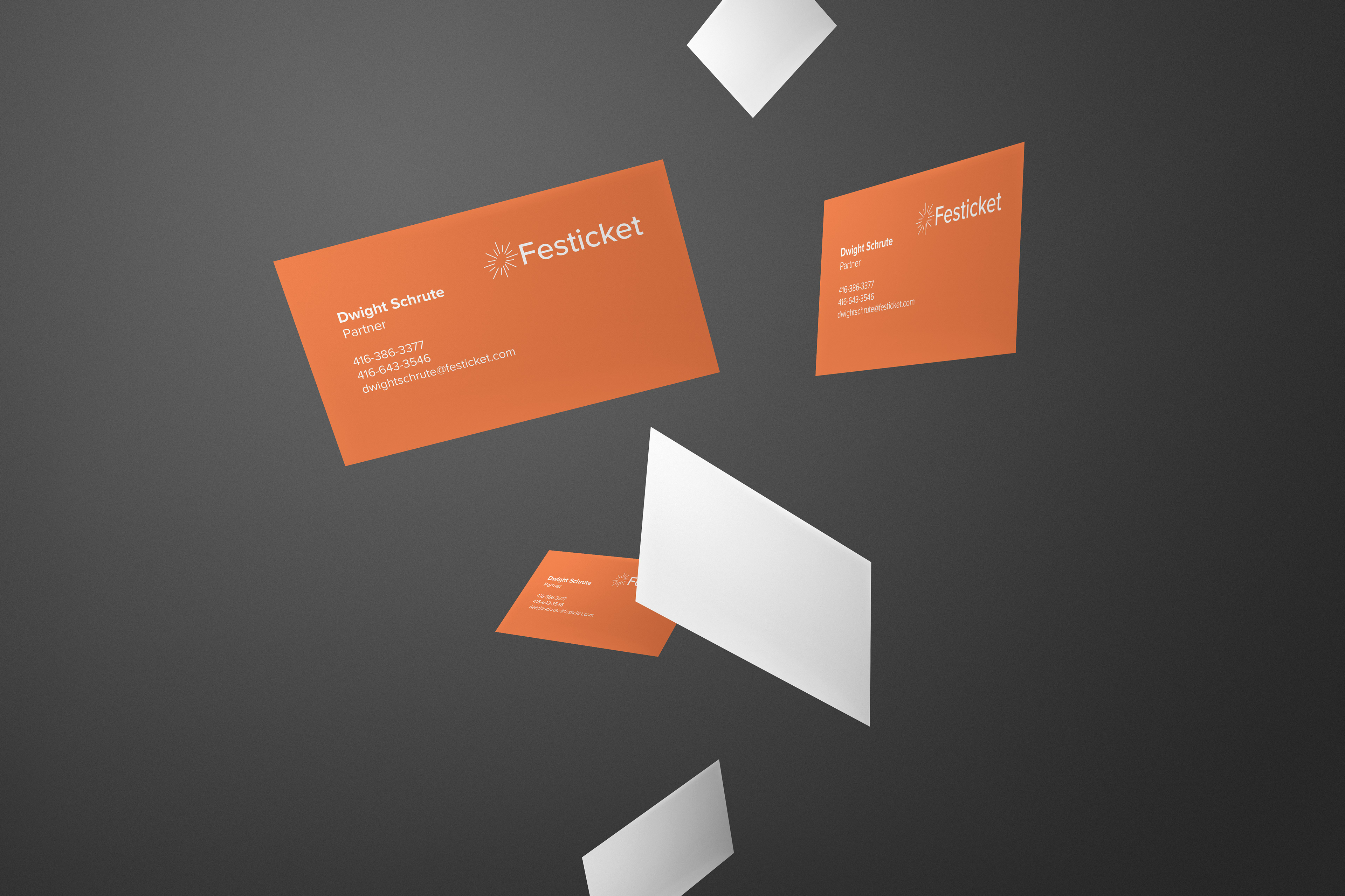

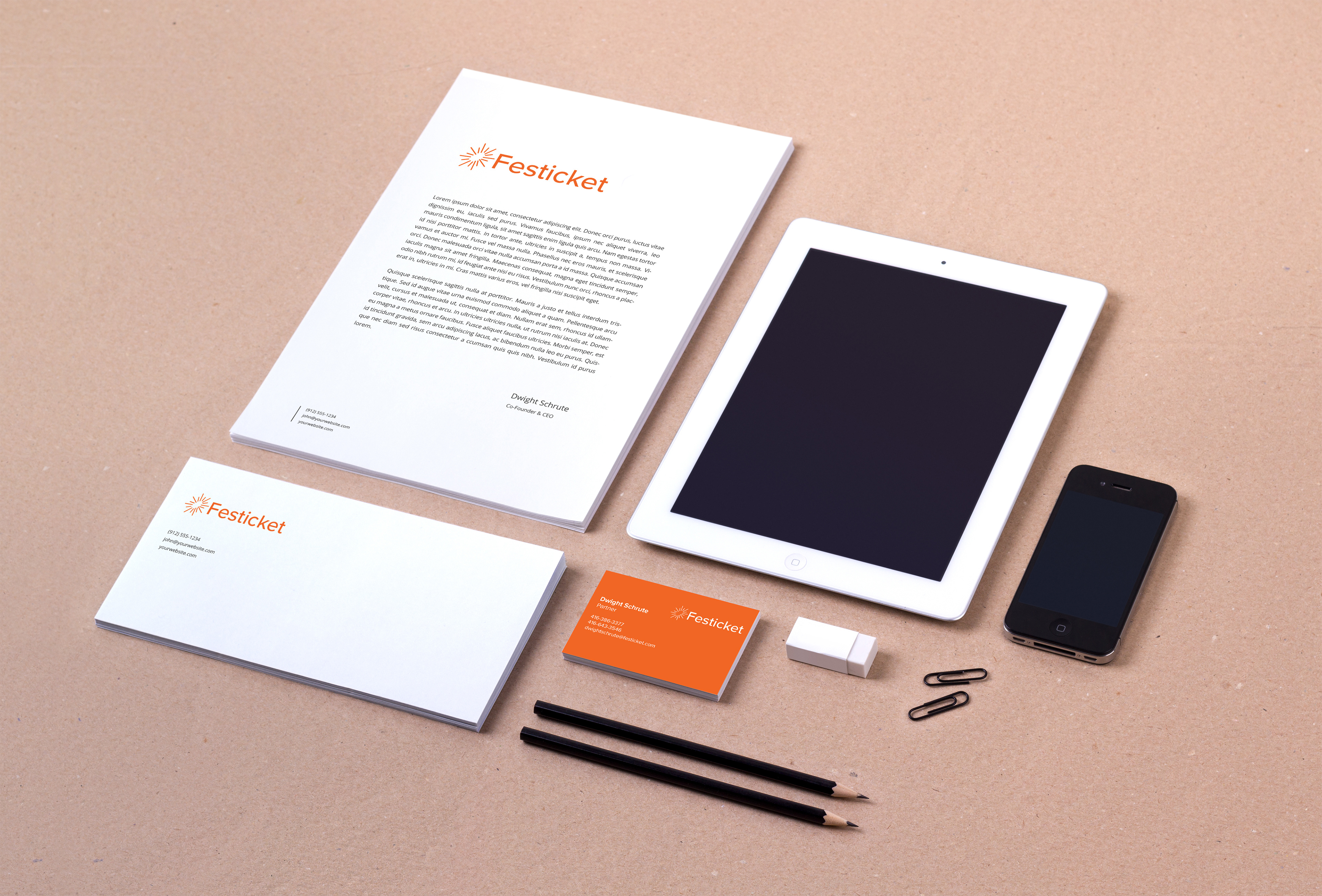
The business card has the logo and all of the information on the front, while the back is blank, reason being that I was going for a simple one side printed business card which saves the company money. The letterhead has the logo left aligned in the top left with the contact information flush left on the right of the logo. Aligning everything at the top leaves plenty of room for the clients to write their letter.
Website
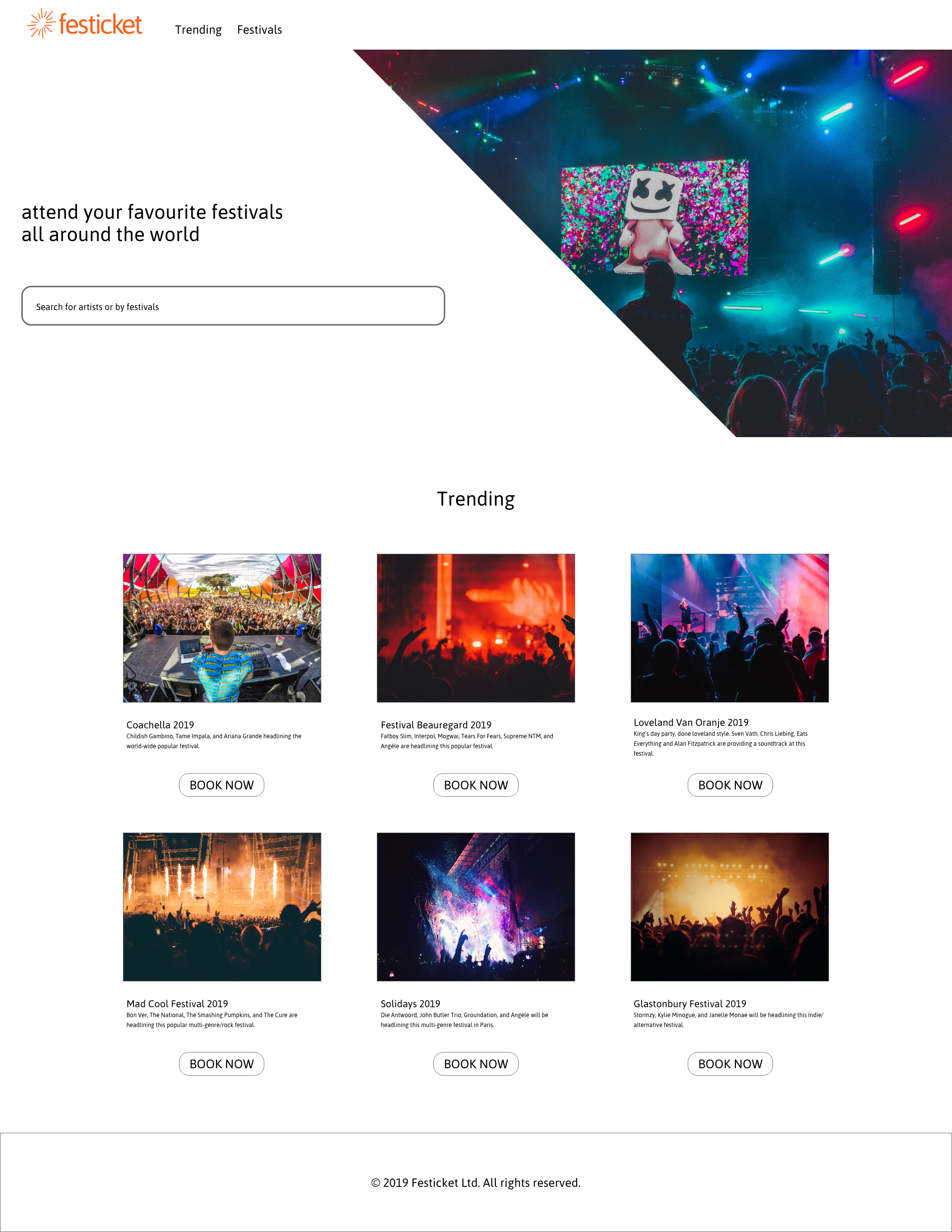
Designed in a modernist style, with a sans serif typeface called “ASAP” used for the entire website. The hero image indicates what the atmosphere and energy would be like at a concert, with a search bar on the left side used for searching for your favourite performers. Trending festivals on the splash screen to interest the customer. Festivals page is for searching for your favourite performers, there is also a filter on the left side to help you narrow down your search. Packages screen is super simple and straight to the point, shows you all the packages that are available for the particular festival that you are planning on attending.
Conclusion
The logo works very well as a system across all of the different touchpoints and can be applied on anything. The bright colours used throughout the branding of the touchpoints will attract more people because when people see bright colours it catches their attention, and most of the people in the demographic enjoy bright colours. The logo and touchpoints follow the brand narrative because they portray modernist, ambition, and innovation. The brand is very innovative in terms of how the logo stands out from the competitors because it is very different, most ticket vendors in the industry don’t really use a symbol but the logo I redesigned does use a symbol. The concept behind the logo is also very strong because it is a firework and when you see a firework go off you feel excitement and that is what a meaningful experience at a festival should be like.