
Client
Self-Directed for School
Role
Logo Design, Branding
Project Brief
In our Corporate Design 1 class we were assigned a project to rebrand an existing company, it could be any company, literally. I decided to select Canada Computers for a rebrand because I feel like it has been a while since they have updated their branding. I wanted to challenge myself to create a new style for the company.
History/Narrative
Canada Computers is a electronic company that sells computers, accessories, as well as parts that would go inside a computer. It founded in 1991, and the first location is in Kingston, ON. Their main goal was to sell products of higher quality at a lower price, so that students at Queens University could be able to afford them while attending school. Canada Computers today has brought on 1,000 employees and has around 30 stores all across Canada. They are very empathic about their customer’s needs, and have built a very strong trust with their customers.
Demographic

The target audience for Canada Computers is young adults typically university students that are in the age range from 17–25. This audience is generally people that are into video games, and would like to build a computer for gaming purposes, as well as people who are just computer enthusiasts and would like to build a computer to save money, rather than spending more money on a pre-built computer.
The Logo: Round 1 of Roughs
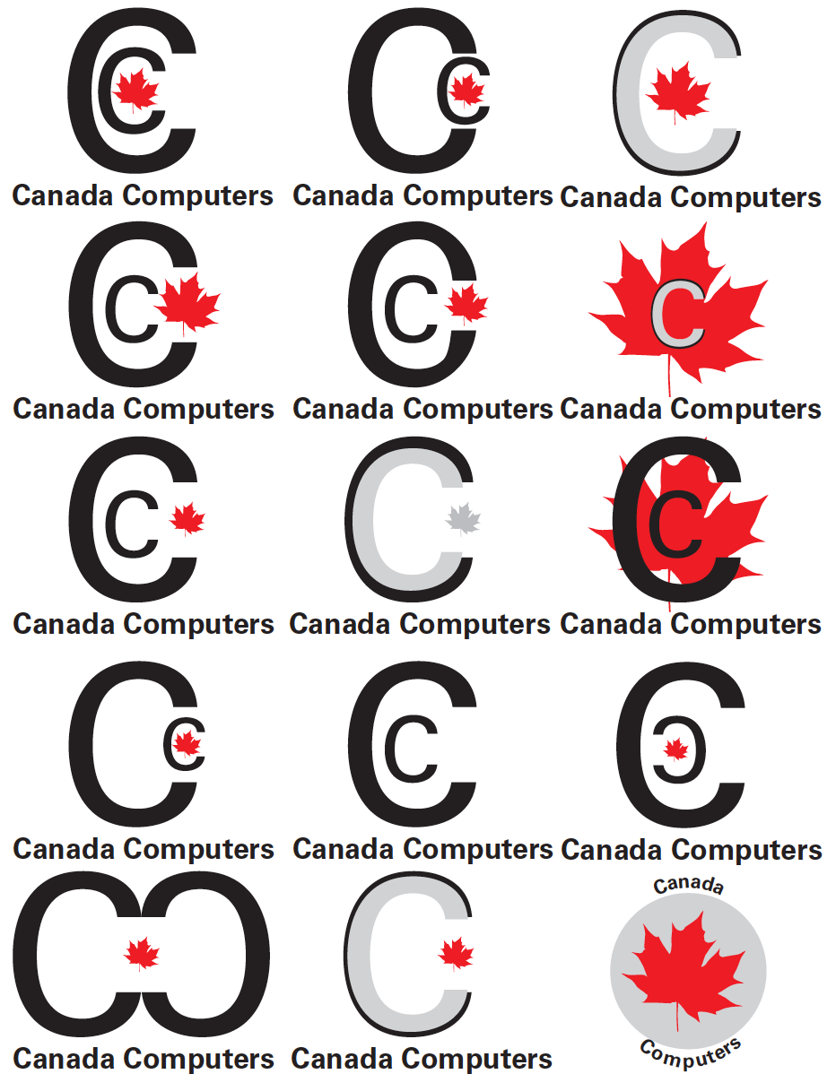
I experimented with many different layouts and concepts for the monogram. I knew for sure that I wanted to incorporate the maple leaf in the monogram somehow. I tried to implement two C’s in the monogram like the existing logo but that didn’t happen very well. So then I decided to take out the extra C because I felt that there was no need for it, and I played around with the C and the maple leaf. I added a drop shadow to the monogram to symbolize both of the words Canada computer and that didn’t work either, because drop shadows are used in a lot of logos and I am going for a flatter 2D look.
The Logo: Round 2 of Roughs

I decided to keep ditch the red and black theme, and kept the brands original yellow colour scheme. I played around with the wordmark, placing it below the monogram, beside the monogram, but I couldn’t figure out what to do with it. I also made a knockout of the maple leaf that I was using for the monogram and tried to place it in the negative space of the counter in the letter “c”, but as you can see it didn’t really work because the maple leaf was overlapping the actual monogram.
The Logo: Round 3 of Roughs
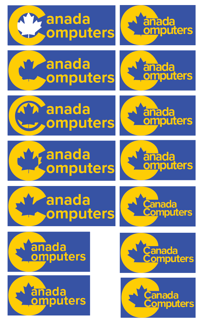
I went through a lot of trial and error when I was creating the final variation of the logo. I wasn’t entirely sure how to make the maple leaf look like it is in the counter of the C. I finally figure it out in my final adjustment to the monogram.
The Logo: Final

I decreased the tracking and the leading of the wordmark, so that it reads easier, doesn’t have awkward spacing between each of the characters and to make it look more visually appealing. I chose to create a new maple leaf for my monogram because the older one that I had in my second round of roughs was a little too detailed, the one I created now is more minimal. I saw an opportunity for a very nice ligature with the letter’s “u” and “t”, I took it and it ended up looking great.
Branding Touchpoints

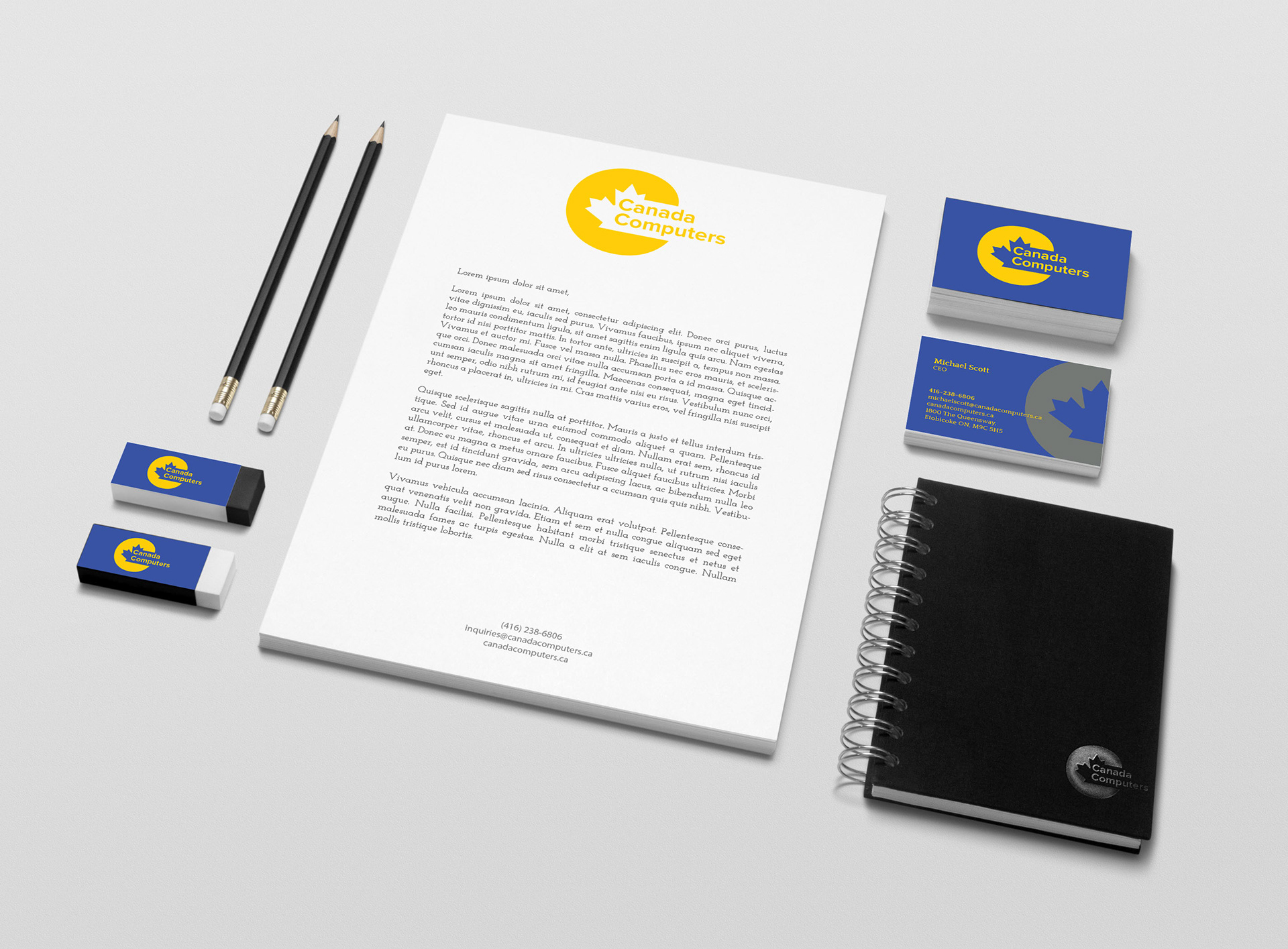
The logo is applied very strongly each of the touchpoints, the consistent use of colour and typography is what makes it tie in with the entire brand. The typefaces used throughout the branding are Proxima Nova which is used for headlines and the logo, and Quattrocento is used for body copy.
The front business card has the information aligned to the left typeset in quattrocento, with the monogram as a branding element, the back of the car has the full logo on a blue background. The letterhead has the logo at the top, with the information center aligned at the bottom to make it in-line with the logo.
Conclusion
Although, I went through a lot of trial and error when I was developing the logo, the most difficult part was trying to make the maple leaf look like it is knocked out in the counter of the letter “C”. I actually ended up created a very modern logo that works very well with the brand narrative/history.
The solution I created for the logo, was I made the wordmark fit in the negative space of the symbol, to make it look like the wordmark and symbol represent each other. The logo is very modern because I selected a very modern typeface, Proxima Nova which is a sans serif typeface. I am confident that the logo I created for Canada computers would stick around for a long time. I learned that doing research and conceptualizing is very important in order to create a successful brand.
Without research you won’t really know what the market is like, and how to make your logo stand out from all of the competitors. The final solution for the brand has a very strong tone, the tone of the brand is to have a place where you can shop and know that the organization you are purchasing items from is a trustworthy company.
The colours are very strong as well, the colour blue represents loyalty, and trust. While the colour yellow represents joy, and creativity. I have plans on doing a redesign of Canada computer’s existing website, as well as creating an app for it, so it is easier to shop for computer parts via mobile.